A logo is the face of your brand. It’s the first impression, the trust signal, and the tiny piece of design that carries big emotional weight. Get it right, and your logo becomes iconic. Get it wrong, and… well, you’ll land on lists like this one. Let’s count down the Top 10 Logo Fails what happened, why it flopped.
10. Mastercard 2006
The flop: Mastercard fiddled with its famous overlapping circles, adding unnecessary detail and clutter.
Why it flopped:
Mastercard’s logo was already one of the most recognized symbols in the world. In 2006, instead of simplifying it for the digital era, they added gradients, transparency, and extra detail.
This was a marketing misstep for three reasons:
The clean, bold circles people trusted became harder to read at small sizes and in different formats. For a global brand, clarity is everything.
Customers had decades of trust built into the simple red-and-yellow mark. By overhauling it, Mastercard disrupted that sense of stability—something risky for a financial brand built on reliability.
The redesign didn’t answer a real business or customer need. Change for change’s sake often creates confusion rather than connection.
Aftermath: The redesign didn’t last. Mastercard quietly reverted back to their original, simpler overlapping circles., in In 2016 they redesigned the logo again and, introduced a sleek, simplified version of its circles, proving that timeless simplicity always beats unnecessary complexity.

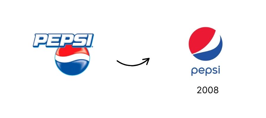
9. Pepsi 2008
The flop: Pepsi spent over $1 million on a redesign that came with a wild brand manifesto. The final result? A tilted smiley globe with shifting white bands depending on the product line.
Why it flopped: The problem wasn’t just the design, it was how the brand handled it. Pepsi made three key mistakes:
The iconic globe had always been about consistency. The tilted white band made the logo look unstable, and product-to-product variations added confusion.
The redesign was justified with a brand manual referencing feng shui, the Mona Lisa, and magnetic fields. Customers saw through the pretension and mocked it.
Pepsi has always been the bold, fun challenger to Coke. This redesign stripped away that personality and left people with a logo that looked like a crooked smile.
Aftermath: Pepsi never walked it back. The globe is still in use today, but the 2009 rollout is remembered as a warning: when your brand mark is already strong, don’t complicate it or oversell it. Keep the story simple, keep the design consistent, and always match the brand’s true personality.
8. Animal Planet 2008
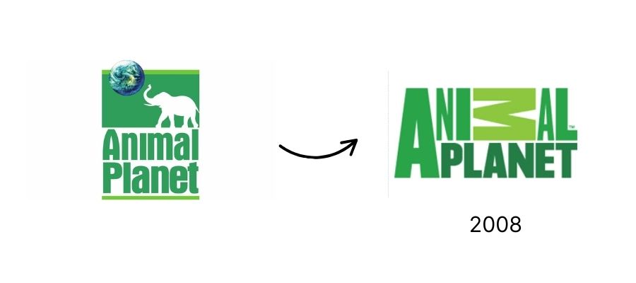
The flop: Out went the playful elephant, in came a stiff wordmark with a giant green “M.”
Why it flopped (the marketing lesson): Animal Planet made several key mistakes:
The elephant was a beloved symbol that tied directly to animals and the channel’s mission. Removing it stripped away warmth and recognition.
The stacked wordmark and oversized green “M” felt awkward and disconnected from the brand’s story. Instead of sparking curiosity, it looked like a design experiment.
The redesign chased modernity but forgot the channel’s essence, wonder, wildlife, and connection. Without those cues, the logo felt generic.
Aftermath: The blocky wordmark lingered for almost a decade but never earned affection. In 2018, Animal Planet course-corrected with a new logo that reintroduced the elephant silhouette—proof that the brand eventually realized what audiences valued most.
7. Yahoo 2013
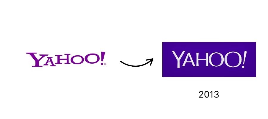
The flop: After a month of teasing 30 possible logos in its “30 Days of Change” campaign, Yahoo revealed… a bland, bevel-heavy wordmark.
Why it flopped: Yahoo made several missteps:
The campaign built massive anticipation, but the final reveal felt like a minor tweak rather than a bold new identity.
Led internally rather than by a top branding team, the wordmark looked amateurish and dated, not what you want for a global tech brand.
Yahoo needed to reassert its relevance against Google and other rising tech giants. Instead, the logo looked stuck in the past, offering style without strategy.
Aftermath: The logo lasted until 2019 but never built recognition or affection. Yahoo eventually replaced it with a simpler, bolder lowercase wordmark that better reflected modern design standards.
6. SyFy Channel 2009
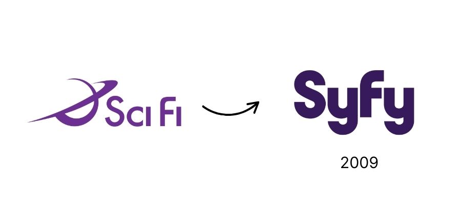
The flop: The Sci-Fi Channel rebranded as “Syfy,” complete with a bubbly purple logo.
Why it flopped: The rebrand failed for several reasons:
“Sci-Fi Channel” was clear and descriptive. Switching to “Syfy” felt gimmicky and confusing, trading recognition for trademark ease.
Sci-fi fans are intensely loyal. The quirky spelling looked childish and dismissive, making the community feel misunderstood.
The bubbly purple wordmark didn’t match the scale or imagination of the genre. It felt more like a lifestyle brand than a home for science fiction.
The channel wanted to broaden its programming, but instead of carefully expanding, they disrupted their base by discarding what people loved.
Aftermath: The name stuck, but the look didn’t. In 2017, Syfy unveiled a sharper, fan-focused redesign for its 25th anniversary. While they never returned to “Sci-Fi,” the refresh helped regain some credibility. The 2009 misstep remains a cautionary tale about alienating your most loyal audience.
5. Kraft Foods 2009
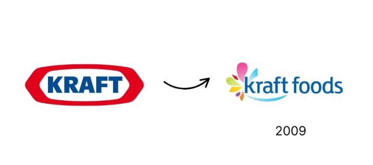
The flop: Kraft ditched its classic red-oval logo for a rainbow starburst with a swoosh.
Why it flopped (the marketing lesson): Kraft made several critical errors:
The bold red oval had decades of equity and strong shelf recognition. Losing it meant losing instant visibility in stores.
The swoosh and starburst looked like clip art, not the mark of a global food leader. It lacked authority and professionalism.
Kraft’s many sub-brands relied on the oval as a unifying umbrella. The new mark didn’t translate across products and fractured consistency.
Kraft stands for comfort, family, and familiarity. The playful new logo felt disconnected from that identity.
Aftermath: Backlash was swift. Within a year, Kraft returned to the traditional red oval, protecting the equity they nearly discarded. The misstep proved how powerful recognition and familiarity are in consumer packaged goods.
University of California 2012
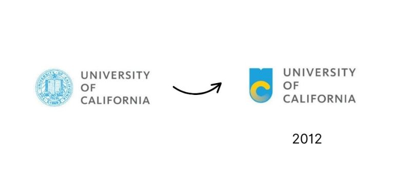
The flop: UC tried to replace its traditional seal with a swooshy, gradient-heavy “UC” mark.
Why it flopped: The redesign failed because UC overlooked key truths about academic branding:
The seal wasn’t just a logo—it symbolized credibility and heritage. Attempting to replace it felt like erasing history.
Instead of conveying prestige, the gradient monogram looked like a tech start-up logo, undermining the gravitas expected from a major university system.
Students, alumni, and faculty are emotionally invested in their school’s symbols. Rolling out a new logo without buy-in sparked outrage and petitions.
UC intended the monogram for digital use while keeping the seal for formal contexts, but poor communication made it seem like the seal was being retired.
Aftermath: After massive backlash, UC suspended the monogram within a week. The historic seal still represents the system in official capacities, while wordmarks and simpler digital treatments are used online. The failed rollout is now a lesson in balancing modernization with respect for heritage.
3. London 2012 Olympics
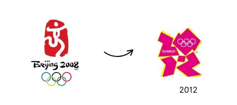
The flop: Neon, jagged, and “edgy,” this logo was supposed to feel energetic. Instead, it was called confusing, ugly, even migraine-inducing.
Why it flopped: London 2012’s logo failed on multiple fronts:
Olympic logos should symbolize unity, inspiration, and pride. This one looked chaotic and disconnected from those values.
Many people didn’t recognize the shapes as “2012” without explanation. A logo that confuses at first glance loses impact.
The jagged style and neon palette felt trendy in the mid-2000s but dated quickly. Olympic logos are meant to endure.
Instead of excitement, the logo generated mockery and controversy.
Aftermath: There was no option to pivot. With the global rollout already in motion, London was stuck with the design. While the Games themselves were celebrated, the logo remains infamous as a case study in choosing “different” over “effective.”
2. Tropicana 2009
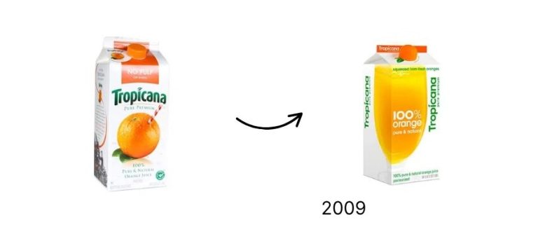
The flop: Tropicana redesigned its packaging and dropped the iconic orange with a straw. On shelves, it suddenly looked generic.
Why it flopped: Tropicana made several costly errors:
The orange with a straw was a powerful shorthand. Without it, shoppers couldn’t spot Tropicana easily in crowded aisles.
Orange juice is a routine purchase. Customers look for what they recognize, not what’s new. The radical change caused confusion and lost sales
The new minimalist look felt cold and clinical, stripping away the freshness and natural appeal the brand was known for.
They changed the Logo, imagery, and typography. The entire look shifted overnight, leaving loyal customers disoriented.
Aftermath: The backlash was immediate. Sales dropped 20% in just two months. That’s a $30 million loss. Tropicana quickly reverted to the original packaging, a clear reminder of how critical brand recognition is in consumer goods.
1. Gap 2010
The flop: Gap swapped its timeless blue box for Helvetica and a tiny gradient square. Customers were outraged.
Why it flopped: Gap made a series of critical mistakes:
The blue box had decades of recognition and loyalty built in. Replacing it overnight with something generic erased that equity instantly.
The Helvetica wordmark with a floating square looked corporate and forgettable, not fashionable or aspirational.
Customers had a nostalgic, emotional connection to the original mark. Changing it without explanation felt like betrayal.
Gap released it quietly online, and when backlash erupted, they suggested a crowdsourcing contest, which only made them look unprepared and unserious.
Gap’s business struggles weren’t about the logo. Rebranding without addressing core issues only highlighted how disconnected leadership was from customer reality.
Aftermath: The backlash was so fierce that Gap scrapped the redesign after just six days and reinstated the original logo. It remains the most infamous logo fail of all time.

The Takeaway for Business Owners
These logo fails remind us of three big truths:
Don’t throw away equity. If people love your logo, think twice before changing it.
Trendy isn’t always timeless. Design should evolve, but it should still feel like you.
Your logo is a strategy, not just decoration. It represents your story, your trust, your place in the market.
When it comes to your logo, aim for connection and clarity.


