How We Refreshed a Therapy Practice Logo and Brand Style
WG Psychology wanted to refresh its logo and brand styling. The existing identity felt too dark, leaning heavily on black and blue tones.
The Brief: Goals and Challenges
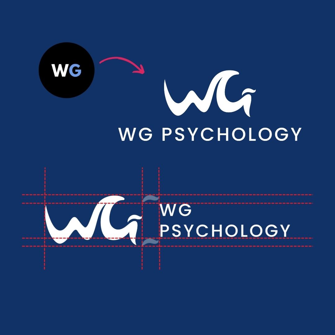
The goal was to create a logo that felt more approachable and accessible while still professional. The new design also needed to reflect the clinic’s strengths: reliability, responsiveness, and a client-centered approach.
The old logo relied on masculine, heavy colors and lacked the warmth the practice wanted to convey. The new design had to reduce that weight, introduce softer tones, and balance professionalism with a welcoming presence.
Core Deliverables
- Logo Design
- Typography & Colour Pallete
- Brand Style Guide
The Craft: Strategy and Execution
We began with three logo concepts, each exploring different directions in color, icons, and typography. Through client feedback, we identified what worked best: approachable color palettes and strong, block-style lettering.
From there, we refined the designs across multiple rounds. We tested variations of wave elements and typography fonts. Each step helped clarify preferences and narrow the direction. The turning point came when we shifted focus to a letter-based design a style that captured the strength of the original logo while feeling fresher and more inviting.
By the final round, we landed on a logo that struck the right balance: clean, professional, and approachable. Alongside the logo, we refined typography and updated the colour palette to reduce heaviness while keeping continuity with the original brand.
The Leap: Outcomes and Evolution
The final logo is modern, simple, and versatile. It reflects the practice’s trustworthiness and professionalism while feeling more open and accessible. The refreshed color palette softens the brand’s presence, making it more welcoming to clients without losing credibility.
This process of exploration and refinement ensured the outcome was not just a new design, but a brand identity aligned with the values and vision of the practice.
Completing the Brand Refresh
The website, social media, and photography were completed first to establish the practice’s online presence. The logo and color palette redesign brought the final piece into place. With this update, the brand now feels consistent across every platform.
Testimonial
Fierce Media has been instrumental in helping me launch the marketing for my clinic, WG Psychology. They’ve always been very quick to respond to requests or questions and provided engaging ideas for our social media posts. I would certainly recommend working with Fierce Media!
Dr. James Watson-Gaze
Director | Clinical Psychologist